Improving your website conversion rate really just boils down to one thing: systematically finding and smoothing out the rough spots in your customer's journey. Think of it as making it as easy and natural as possible for a visitor to do what you want them to do, whether that’s clicking "buy," signing up, or just filling out a form. You'd be surprised how often it's the small, smart tweaks that deliver the biggest wins.
Understanding Your Website Conversion Rate
Before you can fix something, you have to know what you’re looking at. Simply put, your website's conversion rate is the percentage of visitors who complete a specific goal you've set. It's a direct measure of how well your site convinces people to take action.
Think of it this way: traffic is potential, but conversions are results. A website with tons of visitors but a rock-bottom conversion rate is like a bustling retail store where no one ever makes it to the cash register.
The real magic in learning how to improve website conversion rates is all about efficiency. Instead of just throwing more money at ads to get new visitors, you focus on getting more value from the people who are already there. That shift in mindset is what separates struggling businesses from those that grow sustainably.
A tiny lift of just 1% in your conversion rate can have a massive impact on your revenue. Honestly, this single metric can be the difference between a business that’s just getting by and one that's wildly profitable. It's easily one of the most important KPIs you can track.
Setting Realistic Benchmarks
So, what’s a "good" conversion rate? The honest answer is… it depends. You'll often hear 2-3% thrown around as a general benchmark for ecommerce, but that number can swing wildly based on a few key things:
- Industry: A high-end B2B service trying to get demo sign-ups will naturally have a lower conversion rate than an online store selling cheap gadgets.
- Price Point: It’s a lot easier to get someone to pull the trigger on a $20 t-shirt than it is on a $2,000 software package.
- Traffic Source: Where your visitors come from says a lot about their intent and how likely they are to convert.
- Goal Complexity: A simple newsletter signup is a much easier "ask" than navigating a multi-page checkout process.
Your most important benchmark is your own past performance. The real goal is to see steady, incremental improvements over time. Don't get hung up on industry averages; just focus on beating your own numbers from last month or last quarter.
How Traffic Source Impacts Conversions
You absolutely have to know where your visitors are coming from because not all traffic is created equal. The channel a user arrives from gives you powerful clues about what they're looking for. For instance, someone who clicks a super-specific paid search ad has a completely different mindset than someone casually browsing their social media feed.
This is why digging into your conversion data by channel is so eye-opening. The numbers don't lie: visitors from different marketing channels convert at very different rates. Direct traffic, for example, typically boasts the highest average conversion rate at 3.3% because these are people who already know your brand and came looking for you.
Right behind are SEO (2.3%) and email marketing (2.8%), which also attract users who are either actively searching for a solution or already have a relationship with you. Understanding these channel-specific benchmarks helps you put your marketing dollars where they’ll work hardest. You can learn more about these visitor conversion rate benchmarks to get a better handle on your strategy.
We've covered a lot of ground on what a conversion rate is and what influences it. To bring it all together, here’s a quick-reference table that summarizes the core strategies for boosting those numbers.
Quick Guide to Improving Conversion Rates
| Strategy Pillar | Primary Goal | Key Actions |
|---|---|---|
| Data Analysis | Understand user behavior | Track conversions by channel, analyze heatmaps, review session recordings. |
| Friction Reduction | Make the user journey seamless | Simplify forms, improve site speed, optimize for mobile, clarify CTAs. |
| A/B Testing | Validate changes with data | Test headlines, button colors, page layouts, and offers to see what works best. |
| Trust Building | Increase visitor confidence | Display social proof, use clear security badges, offer guarantees. |
Think of these pillars as your foundation. Consistently focusing on these four areas is the surest way to see meaningful, long-term growth in your website's performance.
Designing a High-Converting User Experience
A visually stunning website means nothing if visitors can't figure out what to do. I’ve seen it a hundred times: beautiful sites that completely fail to convert. Great design isn't just about aesthetics; it’s about clarity and psychology.
The best user experience (UX) feels so intuitive that people don’t even notice it. They just glide through, find what they need, and take action without a second thought. Your job is to clear the path and remove any friction between them and your conversion goal.
Crafting a Clear Value Proposition
The second someone lands on your page, their internal monologue kicks in: "What's in it for me?" Your value proposition is the direct answer to that question. It needs to be front and center, usually in a powerful headline and a short, punchy subheading.
For instance, a project management tool could say "Better Project Management," which is vague. Or, it could say, "Finish Your Projects On Time, Every Time, Without the Chaos." See the difference? The second one hits on specific pain points and promises a real, desirable outcome.
A strong value proposition isn't a slogan; it's a promise. It should communicate the primary benefit a customer will get from your product or service in under five seconds. If it takes longer, you've likely already lost them.
Building Trust with Visuals
High-quality images and videos aren't just window dressing. They are powerful tools for building credibility and showing value. Generic stock photos can actually hurt your conversion rate by making your brand feel impersonal and, frankly, a bit cheap.
Instead, invest in professional photos of your actual team, your product in use, or your business location. A quick video demo or a customer testimonial can communicate more in 60 seconds than paragraphs of text ever could. These visuals help bridge the gap between interest and purchase. If you want to dig deeper into this, our guides on web design and development offer a ton of insights.
Designing for Scannability and Focus
Here's a hard truth: people don't read websites, they scan them. A massive wall of text is one of the quickest ways to make a visitor hit the "back" button. To keep them engaged, you need a clean, organized layout that guides their attention exactly where you want it to go.
Here’s how you create a scannable, high-converting layout:
- Embrace White Space: Generous negative space around text and images is your best friend. It reduces cognitive load, making your content feel more approachable and easier to digest.
- Use Clear Headings: Break up your content with descriptive H2 and H3 headings. They act like signposts, letting users jump to the sections that matter most to them.
- Leverage Bullet Points: When you're listing features, benefits, or steps, bullet points are non-negotiable. They're far more effective and scannable than cramming the same info into a long sentence.
This structured approach makes sure your most important messages—and your call-to-action (CTA)—stand out instead of getting lost in the clutter.
Optimizing for Mobile First
With over 58% of all web traffic now coming from mobile devices, a "mobile-friendly" site isn't enough. You need to be mobile-first. This goes way beyond just making your site shrink to fit a smaller screen.
It's about designing for the mobile user's reality. They're often on the go, maybe with a shaky connection, and navigating with their thumb. This demands a different approach:
- Large, Tappable Buttons: Your CTAs and navigation links need to be big enough to tap easily without fat-fingering something else.
- Simplified Forms: Nobody wants to fill out a 15-field form on their phone. Strip it down to the absolute essentials.
- Thumb-Friendly Navigation: Place key navigation elements where a user's thumb can naturally reach them, usually at the bottom or sides of the screen.
When you nail these design principles, your website stops being a simple online brochure and starts becoming a strategic conversion machine. Every element, from your headline to your button placement, works together to guide visitors toward becoming happy customers.
Boosting Conversions with Faster Site Performance
A beautiful design is a great start, but if your website takes an eternity to load, you're practically throwing money away. Site speed isn't just a technical metric anymore; it's a critical piece of the user experience and a massive lever for conversions. Think of a slow site as a leaky bucket—pouring potential revenue right down the drain.
Every single second counts. User patience is razor-thin these days, and a sluggish page is a one-way ticket to the "back" button. It’s the digital version of a ridiculously long line at a physical store; people will just give up and find a competitor.
This isn't just a hunch. The data is clear: faster sites consistently crush their slower counterparts. In fact, sites that load in just one second can see up to three times higher conversion rates than those taking five seconds to load. Compared to a ten-second load time, that number jumps to five times higher.
The effect is even more pronounced for e-commerce. A one-second load time can lead to a conversion rate 2.5 times greater than a five-second load time. You can dive deeper into these and other conversion rate statistics to see the full picture.
Compress Images Without Compromise
One of the most common culprits behind a slow website? Bloated, unoptimized image files. You absolutely need high-resolution photos to show off products and build trust, but they often come with a heavy file size that bogs down your pages. The trick is to find that sweet spot between quality and speed.
You can slash image file sizes dramatically with almost no noticeable drop in visual quality. Before you even upload them, run your images through a tool like TinyPNG or ImageOptim. Many modern content management systems also have plugins that automate this, ensuring every new image gets optimized on the fly.
This one simple step can shave precious seconds off your load times, which is a direct win for your conversion rates.
Harness the Power of Caching and CDNs
Think about how a browser works. The first time someone visits your site, it has to download everything—images, scripts, and stylesheets. Browser caching is a clever way to tell the visitor's browser, "Hey, hold onto these files." So, on their next visit, the page loads almost instantly because the files are already on their computer. It's an easy win for creating a much faster experience for repeat visitors.
To give this speed boost to all your visitors, no matter where they are, you’ll want to use a Content Delivery Network (CDN).
A CDN is basically a network of servers spread across the globe. It makes copies of your site's static files (like images and code) and serves them to visitors from the server that's geographically closest to them. This simple change drastically cuts down latency, making your site feel incredibly fast for a global audience.
Optimize Your Code and Hosting
Beyond images, the very code that builds your site can add to the bloat. Messy or unnecessarily large HTML, CSS, and JavaScript files take longer for browsers to download and process. A technique called minification strips out all the characters the browser doesn't need—like spaces, comments, and line breaks—without affecting how the site works. The result is smaller, faster files.
Finally, your web host is the foundation of your site's performance. A cheap, shared hosting plan might feel like a good deal, but if it buckles under a little traffic or serves files slowly, it's costing you far more in lost conversions.
Here’s a quick breakdown of how hosting choices affect speed:
- Shared Hosting: You're sharing server resources with dozens or hundreds of other websites. A traffic spike on one of their sites can slow yours down.
- VPS Hosting: A Virtual Private Server gives you your own dedicated slice of server resources. It's more stable and much faster than shared hosting.
- Dedicated Hosting: You get the whole server to yourself. This is the ultimate in performance, ideal for high-traffic sites that can't afford any slowdowns.
Investing in quality hosting isn't an expense; it's a direct investment in a better user experience and, ultimately, a healthier bottom line.
Crafting Compelling CTAs and Landing Pages
Your call-to-action (CTA) buttons and landing pages are where the magic happens. This is the make-or-break moment in the conversion journey, where a visitor's casual interest either fizzles out or turns into a real, tangible action. If you want to see your website's conversion rates climb, you have to get this part right.
Think of your CTA as the trigger and the landing page as the laser-focused environment that convinces someone to pull it. A vague CTA or a chaotic landing page introduces friction and doubt—and doubt is the ultimate conversion killer.
The Anatomy of a Powerful CTA
Let's be clear: an effective CTA is so much more than a button that says "Submit." It needs to pack a punch. It should use persuasive, action-oriented language that shifts the focus from what the user has to do to what they get to have.
The gap between "Download" and "Get My Free Guide" is massive. One feels like a task; the other feels like a gift.
Your button copy needs to be active and specific. For example, a SaaS company could see a huge difference by testing "Start My 30-Day Free Trial" against a generic "Sign Up." The first option is crystal clear about the offer, which reduces anxiety and sets proper expectations.
Pro Tip: Don't just focus on the words. Your CTA's color and placement are just as critical. I've seen clients get a noticeable lift just by changing a button to a color that contrasts sharply with the rest of the page. While placing it "above the fold" is a common best practice, the real key is to have it appear logically right after you've made a compelling case.
Don't be shy about testing different button sizes and copy. Sometimes a slightly larger button or more benefit-driven text is all it takes to make a surprising difference in clicks.
Designing a Focused Landing Page
Once someone clicks your CTA, the landing page has to deliver on that promise immediately and without any distractions. The absolute golden rule here is message match. The headline and core message on your landing page must perfectly mirror the ad or link that brought them there. If they clicked an ad for "50% Off Running Shoes," that exact offer better be the first thing they see.
A high-converting landing page has one job and one job only. To support that singular goal, you have to be ruthless about removing anything that could pull the user's attention away.
This usually means:
- No Site Navigation: You brought them here for a reason. Don't give them an easy escape hatch by including your main menu or footer links.
- A Single, Clear CTA: Don't muddy the waters with multiple offers. There should be one primary action you want them to take.
- Frictionless Forms: I can't stress this enough—keep your forms as short as humanly possible. Only ask for the information you absolutely need. Every extra field is another chance for someone to bail.
If you're looking for inspiration, digging into a variety of real-world landing page examples is one of the best ways to see these principles in action and get ideas for your own designs.
Building Trust at the Final Step
Right at the moment of conversion, trust is everything. Your landing page is the perfect spot to ease any last-minute jitters by sprinkling in some social proof. This isn’t about bragging; it’s about showing visitors that other people have made this same choice and are happy they did.
Consider weaving in these powerful forms of social proof:
| Social Proof Type | Example of Use | Impact on Conversion |
|---|---|---|
| Customer Testimonials | "This tool saved our team 10 hours a week!" – Jane D., Marketing Manager | Adds a relatable human voice and a tangible success story. |
| Star Ratings & Reviews | Displaying a 4.8/5 star rating from over 1,000 customers. | Gives quick, scannable proof of quality and satisfaction. |
| Trust Badges | Featuring security seals (like SSL) or industry awards. | Eases security fears, especially near forms asking for personal data. |
When you combine a powerful CTA with a focused, trustworthy landing page, you create a seamless path from interest to action. From my experience, optimizing this final stage is often where you'll find the biggest and quickest wins for your conversion rates.
Using Analytics and Testing for Continuous Growth
Improving your website's conversion rate isn't a project with a definite finish line; it’s an ongoing cycle of learning, tweaking, and refining. You simply can't improve what you don't measure. The only way to find sustainable growth is to stop guessing what your users want and start testing your assumptions with real data.
This approach shifts you from someone who just thinks they know what works into someone who proves it. It’s all about making small, calculated bets, seeing which ones pay off, and then doubling down on the winners. This data-driven mindset is the absolute core of any successful optimization strategy I've ever seen.
Demystifying A/B Testing
At its heart, A/B testing, often called split testing, is a really straightforward experiment. You create two versions of a webpage element—maybe a headline, a button, or an image—and show each version to a different segment of your audience. The version that pulls in more conversions wins. Simple as that.
The most critical piece of any A/B test, though, is having a clear, testable hypothesis. A weak hypothesis sounds like, "Let's test a red button." A much stronger one is, "We believe changing the 'Sign Up' button color from our standard blue to a high-contrast red will increase clicks by 15% because it will draw more visual attention."
A solid hypothesis does three things:
- It states the specific change you’re making.
- It predicts a measurable outcome.
- It explains why you believe this change will actually work.
This structured approach is what separates professional CRO from just randomly changing things and hoping for the best.
Going Beyond the Basic A/B Test
While A/B testing is your reliable workhorse, other methods can offer deeper insights, especially when you're dealing with more complex pages.
Multivariate testing is like an A/B test on steroids. Instead of testing one change, you test multiple changes all at once to see which combination performs best. For example, on a single product page, you could simultaneously test two headlines, three images, and two different button texts. This is perfect for high-traffic pages where you want to understand how different elements interact with each other.
The real goal isn't just to find a single 'winner.' It's to build a library of learnings about your audience. Every test, whether it wins or loses, teaches you something valuable about what truly motivates your users.
Uncovering the "Why" with Behavioral Analytics
Quantitative data from your tests tells you what happened. But qualitative data from user behavior tools is where you find out why it happened. This is where tools like heatmaps and session recordings become absolutely invaluable.
- Heatmaps give you a visual aggregate of where users click, move their mouse, and how far they scroll down a page. They can instantly show you if a critical call-to-action is being ignored or if users are frustratingly trying to click on elements that aren't actually clickable.
- Session Recordings are like watching a DVR replay of a visitor's entire journey on your site. You see their mouse movements, where they get stuck, where they hesitate, and where they ultimately drop off. This provides powerful context that numbers alone can't.
This image shows a fantastic workflow for using this kind of user research to inform your design and testing process.
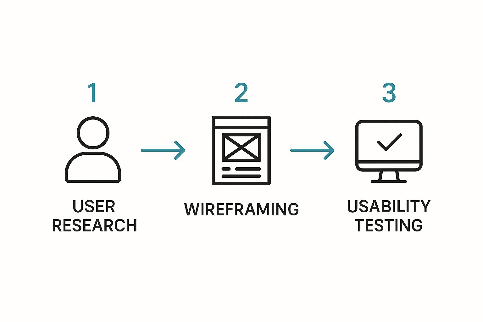
As you can see, effective testing always starts with understanding the user, not just running with your own assumptions.
Key Metrics to Monitor in Google Analytics
Your analytics platform is command central for spotting conversion opportunities. Instead of getting lost in a sea of data, I recommend focusing on a few key reports that tell a clear story about your user funnel.
A crucial benchmark to watch is your ecommerce conversion rate. Globally, you'll see average rates floating between 2.5% and 3%. But looking closer, Shopify's data reveals an average of around 1.4% for its stores, with the top-tier performers hitting rates above 3.2%. This just shows that even small, incremental improvements can push your business into a much higher class of performance.
First, make sure you have conversion goals set up in Google Analytics for every important action on your site. Once that's done, start digging into these key areas:
To help you get started, thinking about what to test can be the hardest part. I've put together this simple matrix to help you prioritize your A/B testing ideas based on how much impact they might have versus how hard they are to implement.
A/B Testing Idea Matrix for Higher Conversions
| Test Idea (Hypothesis) | Element to Test | Potential Impact (Low/Medium/High) | Implementation Effort (Low/Medium/High) |
|---|---|---|---|
| Changing button text from "Submit" to "Get Your Free Quote" will increase form fills. | Button CTA Copy | Medium | Low |
| Adding customer testimonials near the "Add to Cart" button will boost confidence and sales. | Social Proof | High | Medium |
| Replacing a stock photo on the homepage with a video of the product in use will increase engagement. | Hero Section Media | High | High |
| Simplifying the checkout form from 6 fields to 4 will reduce cart abandonment. | Form Fields | High | Medium |
| Changing the main headline to focus on a benefit instead of a feature will lower the bounce rate. | Headline Copy | Medium | Low |
Start with the "High Impact, Low Effort" ideas to get some quick wins and build momentum. This framework prevents you from getting stuck and ensures you're always working on tests that can make a real difference.
By regularly reviewing your analytics, you can spot the leaks in your conversion funnel and generate data-backed hypotheses for your next A/B test. This continuous loop of analysis, testing, and learning is the real secret to a consistently improving conversion rate and a healthier bottom line. For more ideas on how to connect this to your broader efforts, check out our guide on the best online marketing strategies.
Common Questions About Improving Conversion Rates
As you start digging into conversion optimization, you're going to have questions. It's just the nature of the beast. This isn't a field with one-size-fits-all answers; context is everything.
Let's walk through some of the most common questions I hear from business owners and marketers. Getting these cleared up can help you sidestep common mistakes and build some real momentum.
How Long Does It Take to See Results?
This is the big one, and the honest answer is always, "it depends." How quickly you see a real impact from your conversion rate optimization (CRO) efforts boils down to two key things: how big the change is and how much traffic your site gets.
For example, a simple A/B test on a new headline for your busiest landing page might show a clear winner in just a couple of weeks. You can implement that change and see an immediate, if small, lift.
On the flip side, a massive project like overhauling your entire multi-step checkout process could take months. You have the design, the development, and then a much longer testing period to collect enough data to be sure you've actually made things better.
The real secret is to stop thinking of CRO as a one-time project. It’s a marathon, not a sprint. The goal is to build a culture of continuous testing and small, steady improvements that add up to major growth over time.
What Is a Good Conversion Rate to Aim For?
Trying to find a universal "good" conversion rate is a wild goose chase. There’s no magic number that works for every website, and anyone who tells you otherwise is selling something. A strong conversion rate is completely relative to your business.
Just think about the variables:
- Business Model: A B2B software company trying to get demo requests will have a completely different benchmark for "good" than an ecommerce store selling stickers.
- Industry: A site selling $5,000 luxury watches will naturally convert at a lower rate than one selling $5 impulse-buy gadgets.
- Traffic Source: A visitor who clicked on a highly-targeted search ad is way more likely to convert than someone who just stumbled onto your blog from a social media share.
You’ll often see numbers like 2-3% thrown around as an average for ecommerce, but treat that as a very loose guideline. For a lead generation site, hitting 5% on a contact form could be a huge win. Instead of obsessing over industry averages, focus on your own numbers. The only benchmark that truly matters is your own past performance. The goal should always be to consistently beat your own baseline.
Should I Get More Traffic or Improve My Conversion Rate First?
For almost every business I've worked with, the answer is crystal clear: improve your conversion rate first. The return on your effort and investment is so much higher.
Think of it this way: driving more traffic to a website that struggles to convert is like pouring more water into a leaky bucket. It's expensive, it's exhausting, and it’s incredibly inefficient. You're just burning cash to acquire visitors who are going to leak right out because of a confusing user experience or an unclear sales pitch.
By fixing the "leaks" on your website first, you make every visitor—both the ones you have now and all the ones you get in the future—infinitely more valuable. Once you have a solid conversion foundation, every single dollar you spend on ads or SEO will work much harder for you. This is how you build a powerful, scalable growth engine that doesn't just attract more visitors, but actually creates more customers.
Ready to stop leaving money on the table? The team at creavoid specializes in building high-performing websites and implementing data-driven strategies to turn more of your visitors into customers. Learn how we can transform your conversion rates today.

